
The Diaspora Business Starter Pack

A
FROM IDEA TO INCOME: WE LAUNCH YOUR BUSINESS RIGHT
Your all-in-one solution to turn your idea into a fully launched business—registered, branded, and ready to attract clients. We guide you from concept to customer.

B
HIGHLIGHTS
-
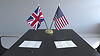
Company registration (UK, USA, or both)
-
Business plan & brand identity
-
Website + logo + content writing
-
Social media setup (IG, FB, LinkedIn)
-
Launch strategy & post-launch support

C
Who We Are
Novel Leaf is a UK-registered hybrid creative agency. We specialize in branding and web solutions for Africans in the diaspora, faith-based organizations, and purpose-driven startups. Our culturally intelligent and strategy-first approach helps your brand make lasting impact—online and beyond

D
What We Offer
-
Diaspora Business Starter Pack
-
Faith-Based Design Kits
-
Startup Launchpad (Brand & Website only)
-
White-Label Design for Agencies
-
AI Brand Builder (Coming Soon)
-
Brand Consulting & Content Strategy
Ready to Launch Your Business?
We totally get it — starting a business in a new place or back home can feel like a lot. Whether you’ve moved from Africa to the US or UK and want to set up something there, or you're in the diaspora looking to build a solid brand back home, we’re here for you. At Novel Leaf, we take care of everything — from registering your company and writing a solid business plan, to building your brand, website, and getting you noticed online. We’ve been where you are, and we know what it takes. You don’t have to figure it all out on your own — let’s do this together and bring your idea to life the right way


A Glimpse into Our Growth
120
TRUSTED CUSTOMERS
25
COMPANY STARTED
12
CHURCH WEBSITES
246
DESIGN PROJECTS